Silent Lights – Behind The Scene
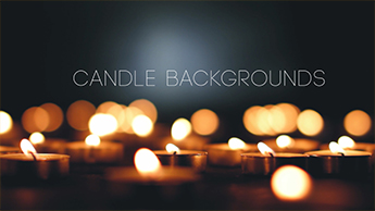
The famous Dan Brown once said, “Sometimes a change of perspective is all it takes to see the light.” When you have 100 tea candles sitting on the floor of your garage and you are looking around trying to find the right angle to film them, it’s all about the perspective from which you are looking.
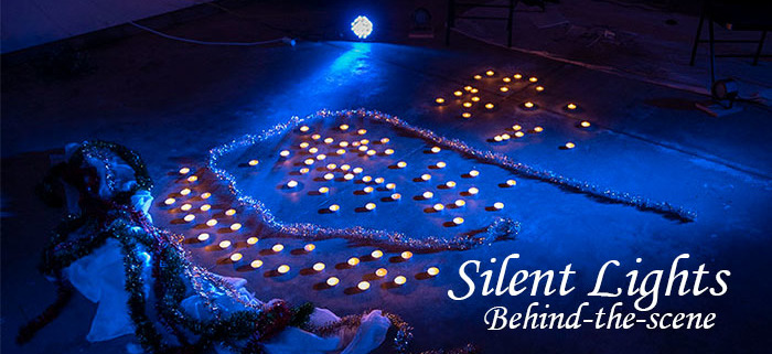
From the top view, it looks nearly like a pile of misplaced items. But, upon a much further and lower perspective, you see depth of field with layers of garland and candles, creating this beautiful motion background package, Silent Lights.
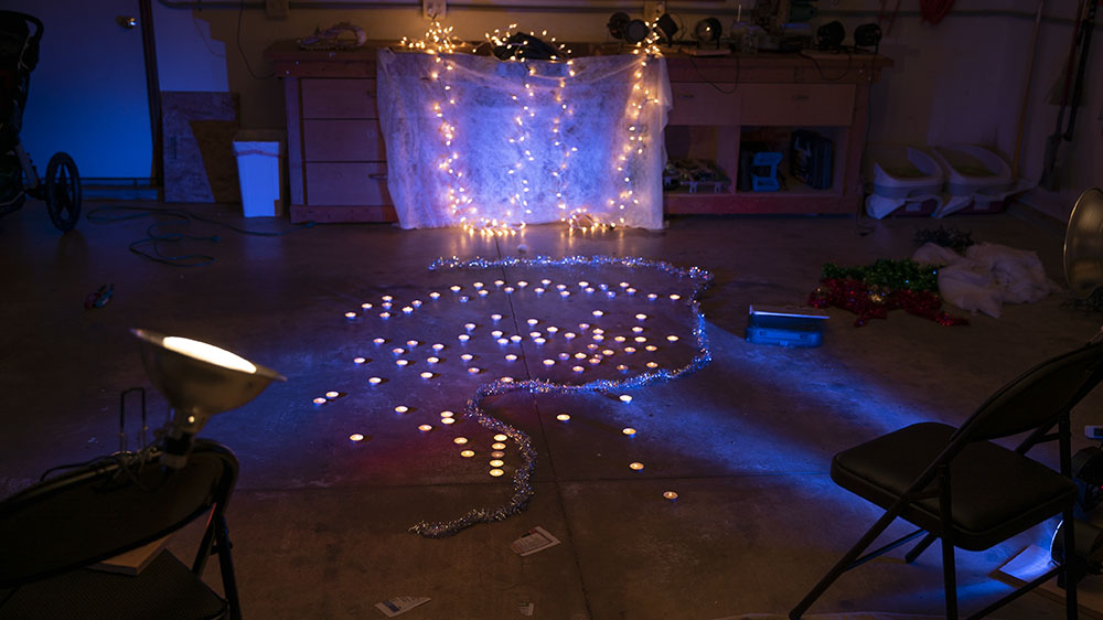
After nearly an hour of digging the candle wicks out of the wax, and then finally lighting them, the task then became figuring out where the garland needs to go. I piled some of near the Christmas lights to see how that looked and it didn’t feel right. I realized that the silver garland create a bokeh effect on the camera and that seemed to look nice. The scene was still missing its intrigue, so I brought in a few LED lights and change their colors to blue to add some contrast to the scene.
Finally, it was too dark, so I took a 3500K flood light and bounced some light off the ceiling to help brighten some of the shadows. It worked well, and since it was rather cold that day, I took a few heaters and set them up. Shooting for another hour took place and eventually, I felt like had what I was looking for.
Then I filmed nearly 15 different backgrounds, before narrowing it down to only the best 7. Several hours of post production, rendering and then posting, and finally, a new motion background package was born. A few take-aways from this experience, always have a light that actually has juice still in it. The flame kept disappearing, making the process of lighting the candles even longer. Second, have an idea of what you want the shots to look like before you set the scene. If you know how you want the end product to look, it gives you a road map for how to set up the scene. With lots of elements in play, someone could spend all day trying different combinations of candles, garland, lights, colored lights, angles, perspectives.
Finally, don’t forget the end user experience. How is someone most likely to use these motion backgrounds. Is there enough screen space for text for lyric videos or worship text? Is there too much light, too dark? Finding the ideal balance is always tough, but a fun challenge. This set of animated backgrounds has been selling nicely, so apparently, someone liked them! Enjoy!





Leave a Reply
Want to join the discussion?Feel free to contribute!